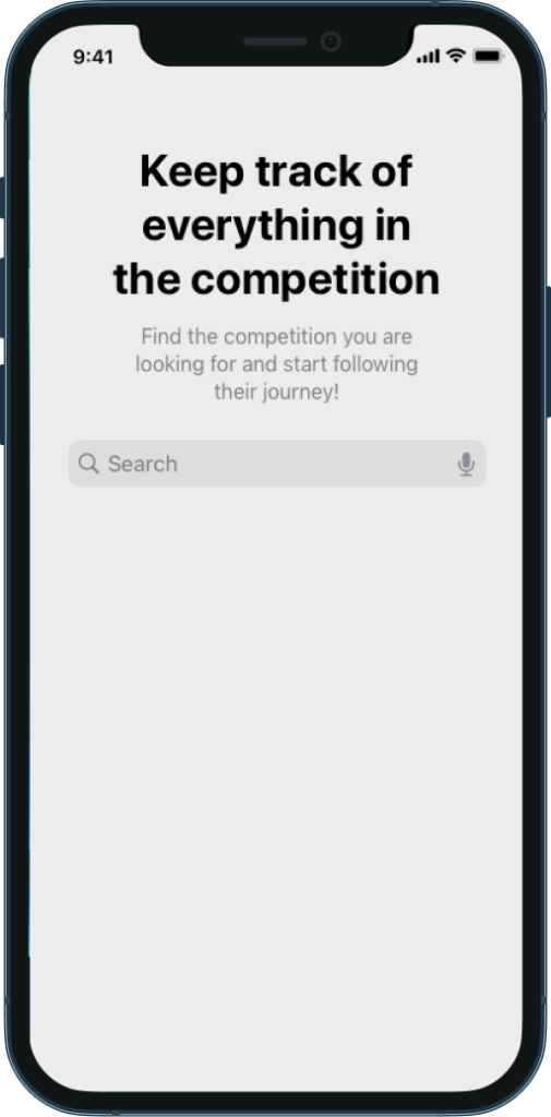
A virtual fitness competitions platform designed for four distinct user types: from the organizer building the bracket to the spectator watching the leaderboard update live.
The fitness competition industry — CrossFit, powerlifting, obstacle racing — is massive and growing. The UX infrastructure supporting it is stuck in the early 2000s. Events still run on spreadsheets, whiteboards, and paper scorecards.
Competitors check in at tables. Judges record scores on clipboards. Organizers update brackets manually. Spectators ask around to find out who's winning. Everyone is staring at their phones — for everything except the competition.
The core problem wasn't technical. It was a design problem: four completely different types of people needed to use one platform, each with entirely different goals, workflows, and mental models. Building for all four without alienating any required research before pixels.
"The goal wasn't to build an app. It was to get phones out of the way during the event — and make them indispensable before and after."
Before any wireframes, I needed to understand each user type from the inside: not as a persona template, but as a workflow map.
User interviews and surveys across the four user types revealed fundamentally different needs. Organizers needed bracket management and real-time override capability. Judges needed a distraction-free scoring interface that worked in a loud, bright gym. Competitors needed registration, heat schedules, and personal results. Spectators needed a live leaderboard that updated without a pull-to-refresh.


Each user type received a tailored experience within a single platform: consistent visual language, radically different interaction models.
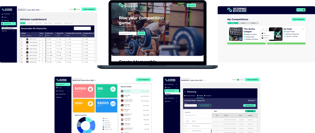
Scoring Deck is a cross-platform product: a web application for organizers managing competitions at scale, and a mobile app for judges, competitors, and spectators using it live at events. The design system had to work equally well on a 27-inch organizer dashboard and a phone screen held in a sweaty hand under gym lights.
The highest-stakes design challenge. Judges operate in loud, high-energy environments, often with gloves on, under time pressure. The scoring interface needed to work with a minimal number of taps, large touch targets, and zero ambiguity about what was being scored and what the current state was. Five variations were designed and tested before the final model was validated.
Organizers manage competition day from a web dashboard: real-time leaderboards with per-category filtering (RX, Scaled, Masters), heat assignment and bracket management, and manual score override capability for when edge cases arise on the floor. The design prioritized speed of action over visual delight — every critical function is reachable in two clicks or fewer.
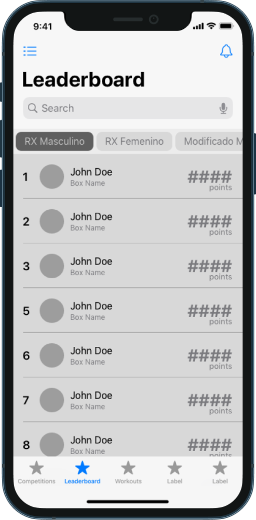
Competitors and spectators get a real-time leaderboard that updates without a manual refresh. The competitor experience is also built around the competition-day timeline: registration confirmation, heat notification, warm-up reminder, live scoring, and final results all sequenced and delivered automatically. The platform replaced an entire PA announcement system with a silent, personal notification flow.
Home — personalized per user type at the same entry point
Competition — live heat status, at-a-glance in bright gym lighting
Leaderboard — updates in real time, no pull-to-refresh required
Usability testing was conducted with 5 core tasks across all user types. The judge scoring flow — the most technically demanding interaction — was completed without error by all participants on the first attempt after a single orientation.
"The leaderboard auto-update was the thing I didn't know I needed."
Spectator participant, usability testing